How to Color Your Comic like Christwriter
I've had several people ask me how I do my coloring, so I've decided to put this tutorial together. It's written using Photoshop. Users of GIMP and similar programs with Layers should be able to adapt it to their needs. All you really need is a scanner and a program with layers and layer settings. I do, however, suggest getting a tablet if you're going to be doing digital art for longer than a few months. You CAN produce good work with a mouse, but it's difficult and not exactly hand friendly.
First off, I'm assuming you know the basics of Photoshop and how to scan and clean up images. If not, I'd suggest you go here and here for quick tutorials, and then come back after you've practiced a while. Experience doesn't really matter, but it really does help.
Alright. Lets get started.
Step 1: Line art
Draw something and scan it into your computer, or if you've got a tablet and lots of patience, you can draw it straight into Photoshop. If you're drawing on paper and scanning it in, I'd suggest you ink it well and erase your pencils completely. You want clean, neat lines that are easy to select all at once.
It's also a good idea to lock your line art layer, as well as any layer you are not currently working on. Nothing sucks more than drawing on a layer you'd already finished, screwing up and realizing you now have to throw the whole layer away.
Another thing you may want to do is keep your layers in sets. If you've never done this before, on the bottom of the layers menu, left to right, are the trashcan icon, the "new layer" icon and the icon that looks like a small folder. That's "new layer set" icon. Click on it, and then put the line art layer in the little folder that appears in the menu. You don't NEED to do this, but it will help keep your layers organized.
Alright. On to step 2, in which we start getting screen shots:
Step 2: Doing Flat Color
At this point, you should have two layers, your background layer and your line art layer. One thing I will do frequently is give you screen shots of my layer menu so you can tell whether or not you've got the right layers in the right places. Call it a way to check your work. Right now, your layers should look like this:
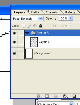
Now we are going to do something that will make sense in a minute: we're going to put your panel divisions on a layer seperate from the line art.
Make a new layer (and put it in a new layer set if you'd like) above your line art, then go over and get the square vector shape. Then draw a big square around one of your panels:
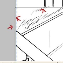
Then, go over to your layers menu and click on the "Paths" tab:
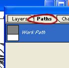
(if it's not there, go to Window and check "Paths". It should appear) make your foreground color black, then get out the brush tool and choose a small, hard, round brush. Now, in the paths menu, right click on "work path" and click on "Stroke". You should get a small dialogue box. Click Okay. A small black line should appear around your path line:
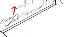
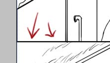
Right click on work path again, and this time do "delete path". Repeat for however many panels you have. You can use the pen tool for odd shaped panels.
Okay. Layer menu check. Now you should have this:
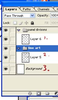
Three layers, two layer sets. Time to start doing real color.
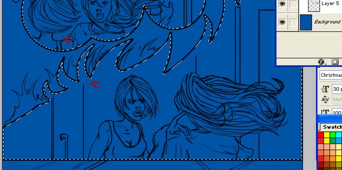
Click on your background layer. Get your paint bucket, pick a color, and fill in your background with the color. Now get out the wand tool and go back to the panel divisions layer. Select the inside of every panel:
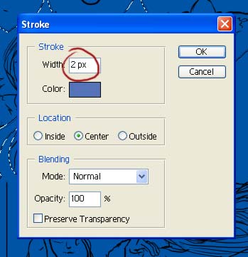
Go back to your background layer. Choose a color a little bit darker than your base color (what you filled the background layer with) Get your marquee tool and right click on the image. Click on "stroke". Put a 2 in the dialogue box and click Ok:
Now deselect.
What you just did was put an outline of your panels on your background layer. You can check this by turning off the panel division layer.
Why did we just do this? Well, this way you can select the entire panel area by going back to the background layer and clicking inside one of the outlines. This will come in handy, as we shall see later.
Do Select All (cntrl+A) and then copy (cntrl+C) and paste (Cntrl+V) a new layer in above the background (Put it in a new layer set). You will not work with the background layer again. Unfortunately, you can't lock it, either. Be very careful whenever you do anything with this layer, as it is very important you keep those panel layouts.
Alright. Now your layer menu should look like this:
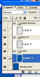
Using the wand tool, select the inside of one of the panels. Get out the brush tool and pick a color for something. You probably have people in whatever it is you're coloring right now, so we'll start with a flesh tone. Get a hard, medium-sized brush and paint your people:
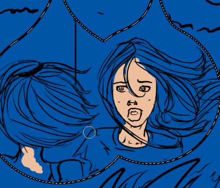
The reason why we have this area selected is so that we don't color into another panel's space:
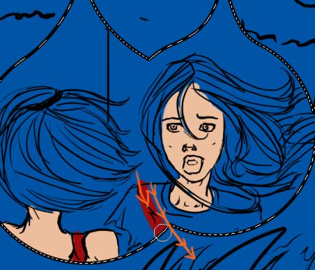
It helps to keep your image nice and clean. Be careful not to color outside the lines or to leave large spaces between the lines and the color. Continue to color by selecting the panels and then coloring the objects inside. Come back when you're done:

Yay, we've got all our flats done! So now we start shading, right?
Well...kind of. Lock this layer, then copy it and paste in a new layer above it, just like you did with the background. Your layer menu should look like this:
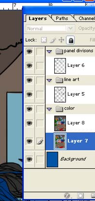
Now we can start shading.
Step 3: Shading
Get out the wand tool again, and select an area of color:
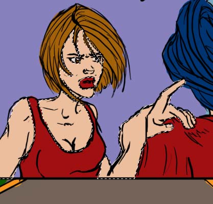
Now, decide where your light source is coming from. Mine is the sun, which would be located up and a little to Lucy's right. It is very important that you know where your light sources are, and that you keep them in mind when you're shading. Ok, get the gradient tool. On the tool bar, set the gradient tool's mode to "Linear Burn" and it's opacity to 30-50%. I like 40%:

With the gradient tool, click in the middle of your selection and drag it towards your light source, then let go. You should get something like this:
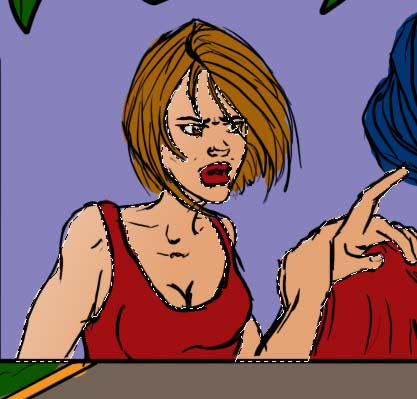
You may also need to do this more than once. Click outside the selection and drag towards the light source.
(tip: The crawling lines are about to get very, very annoying. A good trick is to use cntrl+h to make them go away. The area is still selected, but the black and white lines are gone.)
Okay, we're shaded! Just not very well! Time to do a little actual painting and contour the shadows to her body. Get your brush tool and choose a nice, big, fuzzy brush. Set it's mode to "Linear Burn" and it's opacity to 20-40%. You want to get a nice, gradual darkening. Start brushing on the side opposite your light source. We're going to get those shadows nice and dark:


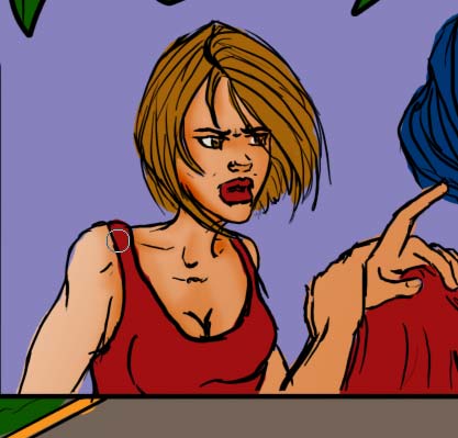
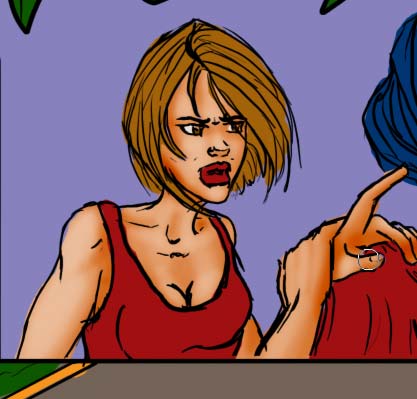
Alright, good enough. It's starting to come together, but we're not done yet. Go back to the tool bar and set your brush's mode to "Normal". Leave everything else alone. Now brush where there should not be shadows:


Ok! One more step. This time to add in highlights, where the light hits strongest. Set your brush mode to "Linear Dodge" and turn the opacity DOWN. 5-10% is just about right. Be very, very careful with this. It is VERY easy to overuse your linear dodge. You want a very slight lightening that takes a few brush strokes to see. You can always add more. You can't always take it off. Brush the "tops" of her body...the high points where the sun would hit strongest:


Now before we go further, I'm going to answer the all important question: What do I do if I screw up? Well...this is another reason NOT to work directly on your flat colors. Hit the backspace button. The place you were working on is now deleted, leaving the flat layer visible, with the original color right there! All you need to do is get out the paint bucket, hit alt to get the color, and refill the area, and then go back to work. If you make a mistake and don't realize it until you're several colors ahead, you can go to the locked flat layer and highlight the mistake area, then go back to your work layer and delete it and refill the space with the old color. It doesn't matter how badly you make a mistake, some of your work is always salvageable.
Ok, there's one more step to this part of the coloring process, and it's probably both the easiest, and the most important. This really makes the image POP. Keep the brush tool, but get a SMALL fuzzy brush. Leave the mode set on Linear Dodge, but set the opacity to 30-50%. You want it strong this time. Now with your tiny fuzzy brush, draw a line on the SHADOWED edge of your image:


This is the secret weapon for making it pop. It doesn't look like much at all, and it goes against all logic, but that bright line on the shadowed side makes all the difference in the world.
Okay, again, repeat for everything else:
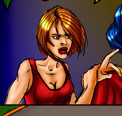
Don't forget about the bright lines:

Okay, that's the shading step done. We're nearly done, but there's a few problems with this. For one, the colors are RADIOACTIVE BRIGHT. Not bright, but BRIGHT!!! We need to take care of that. Second, the shading could use a little more fine tuning and third... those lines look awful stark, don't they? Well, lets take care of all of it.
Step Four: Fine tuning the Shading
An odd fact of color work is that, while our eyes see shadows as areas of black or gray, the color that actually looks best as a shadow is purple, specifically a dark, blue-purple color. Again, don't ask me why. Purple just works the best.
Make a new layer above the shaded layer. Set it to multiply and fill it with a dark purple color:
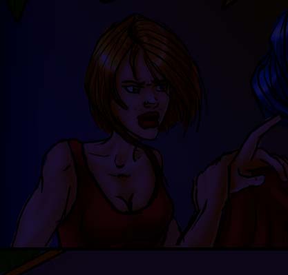
Ouch! This is mid-afternoon! Not the middle of the night! But we can fix that. Set the opacity of this layer to something between 20-40%. I use 35%. You may want to use a different % to get the look you want:
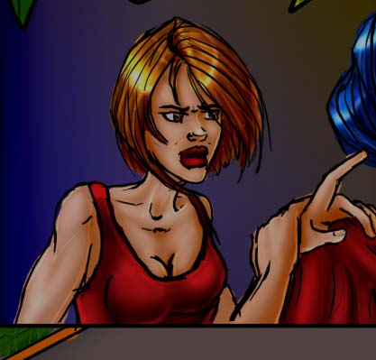
Now get out your brush tool. Big fuzzy brush, Mode is normal, opacity is 20-50%, and we're going to use white as our foreground color and the purple color as a background color. Now brush the white on the areas closest to the sun. You may only want to do this on the important objects, to save time:
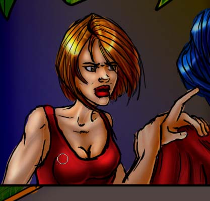
Add some white to the bright line area:

Okay. Now your shading is a little more dramatic. You can make it brighter or darker depending on the time of day. Now lets play a little with the line art.
Step Five: Make the Line Art "Glow"
I read somewhere that the technical term for what we're about to do is called a "glow". I'm not sure if that's accurate. Regardless, we're going to make the line art a little less prominent. Get your wand tool and highlight your line art layer. Select JUST the line art. You do not want anything selected that is not a line. No white areas, no fuzzy gray areas. Just black line art. Should look like this:
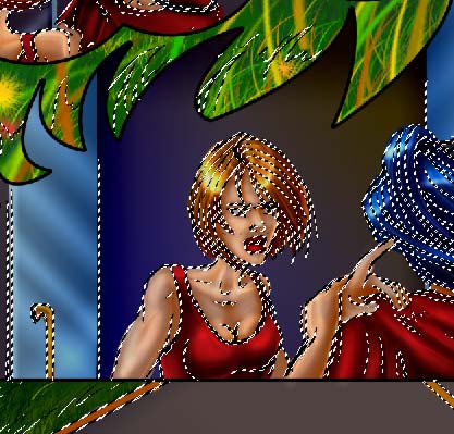
Make a new layer set and a new layer above the line-art layer. Set the new layer's mode to "Linear Light". Now turn off the crawly lines using Cntrl+H. Again, your area is still selected. You've just turned off the lines. This is critical for this part because you HAVE to be able to see what you're doing.
Get out your brush tool. This time all you really need to do is get out a color similar to the object's color. Again, lets start with Lucy's face. Get out your flesh color. Brush's mode should be normal, opacity about 50%. Brush over the line art like so:


Use the same color as her hair:

Ooops! The red that I used for her dress is too dark! It's not showing up when I brush it over. No big deal. Let's just go one color brighter, but in the same family:
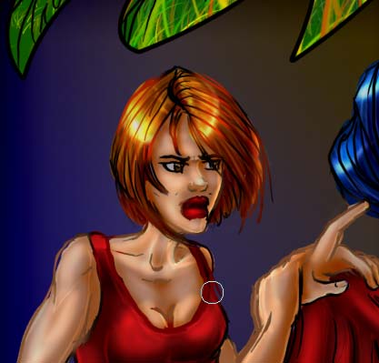
This is a very subtle thing, like the bright lines, but it's another thing that will make your image pop.
Now, for the final step. Time to tone the color down.
Step Six: Desaturation.
This is really, really, really easy, and you'd be amazed with what you can do during this step.
Flatten your image. Yes, you heard me. Flatten it. Select all and copy. Now undo the flattened image. You should get your layers back. Make a new layer set and a new layer, and paste your copy into the layer.
Layer menu check time! What, you thought I'd forgotten?:
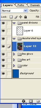
Now, totally desaturate this layer. In Photoshop, you do this by hitting cntrl+shift+u. you want this layer to become black and white:
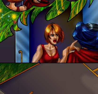

Now set the opacity of this layer to 20-75%, depending on how bright or dim you want the colors:
75%:
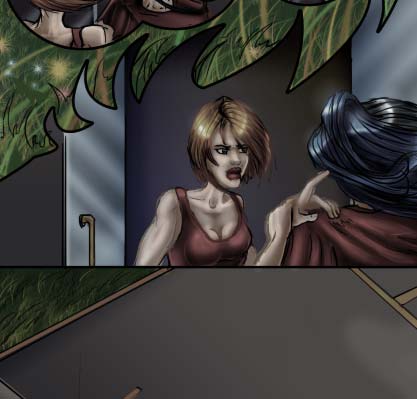
50%:
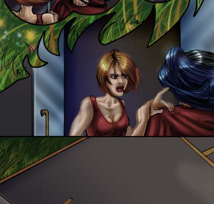
30%:
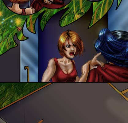
I like 35%:

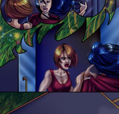
And that's it! The completed page looks like this:
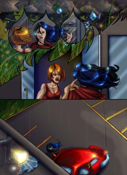
Again, this is an extremely flexible technique. While you're doing this, experiment. See what happens if you cut a step out or do a step a little differently, and start thinking about how your coloring will help your storytelling. Perhaps you just do the complex coloring to the main characters and the key items you want the reader to notice. A fun experiment would be to add some color to the desaturated layer and see what happens.
I made mine blue! This is what it looks like:
Most importantly, have fun with it! Use bits of this technique to add to the one you're using, or use it as the spring board for building your own style.


